
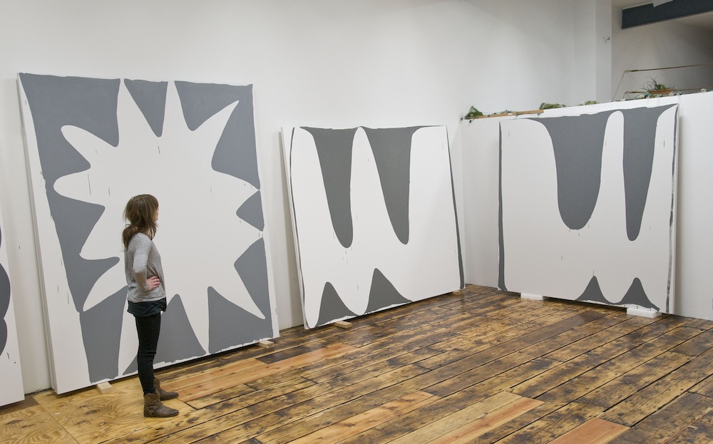
Feldman in her Brooklyn studio. Photo by Mary Jones.
Amy Feldman’s paintings definitely put the “form” back in formalism. Big, bold shapes squirm, teeter, and blast out of their white grounds like the thought balloons of a superhero in a comic book. Staunchly gray on white, Feldman’s palette in particular separates her rigorous practice from much of the abstract painting of her contemporaries, and resists any easy categorization. Critic Stephen Westfall thought of William Gibson’s Neuromancer, quoting “the color of television, turned to a dead channel.” Many connections to the neutral palette have been made along the walk to Feldman’s studio in an industrial part of Brooklyn.
With simple and strong contrast, Feldman’s forms activate the ground, dispelling any metaphors of the mechanical. Expressive, letter-like cartoon and carnal shapes drive Feldman’s unique, psychologically charged language. The rigorous simplicity of the work embraces the fundamental elements of painting, a barebones approach of all or nothing, without revisions or second layers. The shapes can be humorous at times, as are her titles. Several other painters of her generation have embraced the idea that paintings can function very much like a skilled stand-up comedian. This seems especially true of Feldman: the moment is fast and exhilarating, the humor is not always comfortable or tame, and she usually pokes into some very anxious territory. But more importantly, the timing is everything. This is most evident in the improvisation necessary to construct the paintings. The compositions reflect the artist’s active drawing practice, functioning as a “rehearsal” of sorts, a preparation for the work on the canvas, which has no second acts.
I interviewed Feldman in her studio about Gray Area, a body of work recently shown at Sorry We’re Closed in Brussels.
Mary Jones Barry: Schwabsky’s essay “Great Gray” addresses the fact that the set up and preparation for a painting could take as long as the painting itself. Do you feel that there’s a performative aspect to your work?
Mood Mode, 2013. Acrylic on canvas, 80 x 85 in. Photo by Cary Whittier, courtesy of Blackston Gallery.
Amy Feldman: Yes. I make a lot of preparatory drawings and take a lot of time mixing the colors beforehand. Then, it’s one, two, go. I give myself one chance to make the work. It’s related to delivering the punch line in that respect—if you don’t get it right, the audience doesn’t laugh. Either it works or it doesn’t. It’s all or it’s nothing. The performance happens in the application of paint to canvas, and the viewer can almost re-create the steps that were taken to make the painting. I love Robert Ryman and Ryman worked on these terms. I’ve read a number of texts about him because I think his work is an anomaly on some levels; and think many artists of my generation are interested in him as the “minimalist misfit.” Ryman said “When I do a painting, it’s a one-time thing.” His material assertion of paint through space and time is compelling to me.
MJ: Is any reworking possible? Or is it all about the risk?
AF: No, reworking isn’t possible. I like having the clean sheet. Risk and anxiety are important. I want to communicate a clear urgency and the work must feel immediate and direct.
MJ: Humor is often ascribed to your work. Is this intentional? And do the titles deliberately direct the viewer towards a lighthearted, humorous read?
AF: I intentionally inject humor into my work. I don’t think of it as a byproduct because I’m conscious of it. The cartooned forms and lightheartedness in the way that I handle paint counterbalances the gray palette and monumental presence of the paintings. I title every work carefully. For my last show in Stockholm, I had a painting called Omen Amen and another called One Gob. For my current exhibition at Sorry We’re Closed, POW NOW, Savior Wavier, Hello Tableau, and Dark Peace are favorites. I like Social Ditto and Obsession Compression very much as well.
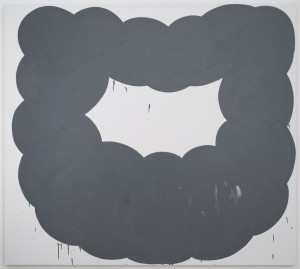
Dark Peace, 2013. Acrylic on canvas, 80 x 90 in. Photo by Cary Whittier, courtesy of Blackston Gallery and Sorry We’re Closed.
MJ: How do you arrive at these titles? They seem very particular. Do you keep lists of possible titles, or do you discover them during the process?
AF: I don’t keep a book of them, but sometimes I know the title before I make the painting. Recently it’s been the opposite, where I’ll be making the painting and then assign the title to it. Well, that’s not entirely true . . . I can’t wait to title a painting “Holy Over.”
MJ: I know that you worked for Suzanne McClelland at the beginning of your career. Her work is very much about language. In recent reviews of your work, your forms have been said to allude to a kind of letter. Do you think that there’s been an influence?
AF: I love Suzanne’s work! Language in her work is altogether text, picture, paint, and sound. I think Suzanne and I are attracted to the visual component of language. I use language differently though, in a more isolated way. I might make a singular letter “O” shape form, for instance, that takes up the entire canvas. The “O” can allude to a zero, or a zeroed out form, and has a reference to multiple things, including starting over.
MJ: Christopher Wool’s retrospective at the Guggenheim included allusions to punk as part of his aesthetic influences, and to the time in New York City in which he emerged. I personally like to think that that’s part of Wool’s nihilism, which I really enjoy. Barry Schwabsky mentions your work as having “punkish élan.” Do you feel there’s a certain defiance at work in your paintings?
AF: I agree with Barry’s statement about my paintings and think that there is a rebellious quality in my work. I like stuff that is big and bad, bleak and tragic and beautiful, but that notion is also funny to me. Contrary to Wool, there’s really no room for doubt in my paintings. I make confident and optimistic paintings. That’s part of it, even if they are reckless in their optimism.
MJ: Walking around your studio, you talk about the importance of scale, both in relationship to your body, and also to the figure/ground relationship. Can you elaborate?
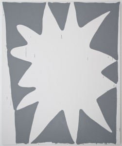
POW NOW, 2013. Acrylic on canvas, 96 x 80 in. Photo by Cary Whittier, courtesy of Blackston Gallery and Sorry We’re Closed.
AF: The scale of my paintings is just a bit larger than my arm’s comfortable reach, so I have to move around a lot while I am making them, hopping on and off a step ladder or milk crate. Although the paintings are big by most standards, they are not enormous. Their size feels accessible but can also be disorienting, depending on the installation. My work plays with schemes of its own power in this regard.
I have had a lot of opportunities to show in small spaces and it is always a challenge to make big paintings work together with the given architecture. I think one of the successes of the works is that they do look good together. Even when crammed into a space, they hold their own. Compression between the pieces heightens the viewer’s attention to the edges of the paintings. I am totally fixated on the margin and how it cues in the subtlety of the grays.
I am also obsessed with figure/ground relationships and negotiating the space between them, the space that flips between something and nothing—an attentive and imprudent flip. When the works get large, a chunk of figure that you could almost hold onto becomes ground, and vice versa. I am interested in highlighting the areas between figure and ground that might be ignored. These are the areas that the drip embodies. The drips are completely accidental, but I see them as integral to the overall image structure. They are part of the punch line I mentioned earlier. The drips subvert the image and you get the joke.
MJ: How did your process, and this bare bones approach to the painting, evolve?
AF: Before I’d been working on paintings that were more constructed, worked, and reworked. Then, at Skowhegan, there was the chance to make a fresco. There’s a lot of surface preparation involved and a significant time element in the application process. If the lime surface gets too dry or if the pigment gets too thick, the color won’t stick and will flake off over time. About three quarters of the way into the process, you know if it’s working. There’s a magic that happens. I was told that the Italians call it tempo d’oro—“the golden time,” when the fresco glows, sealing in the pigment. Unlike most frescos, the image I made there was unplanned. I just mixed my color and did it. It is still hanging outside down by the lake. The image is so basic but there were many complicated decisions that I made while painting it. I had a really emotional response to making this fresco and was terrified by its permanence. I think that anxiety gave me fuel and informed my current work. When I make a painting now, I am still interested in the same kind of immediacy and bare bones economy. It’s about finding a very clear instant of finish and getting that golden glow, but in gray! I like that my work can be dark and elusive and buoyant and pop at the same time. I also feel it’s important to get images out quickly, but maybe that is a generational thing.
MJ: How so?
AF: I think many artists of my generation are interested in how information is received and forwarded. We are in an age of information and I feel like I am on constant overload—one step behind or ahead of the latest. The recurring urgent message creates perpetual anxiety. It’s a normalized anxiety that becomes funny because it’s so ubiquitous and habitual. For me, painting is one way to distill and export. Sometimes I think my paintings are like big headlines, each one a container for its own bit of information. They are pretty direct, printed in boldface, per se, but also quiet and loaded. As pictures, they function singularly, but if you see enough of them you’ll get more of the whole story—it’s a sincere tale, but a parody at the same time, one that chronicles my tragic and comic love affair with painting.
For more on Amy Feldman and Sorry We’re Closed, visit the gallery’s website.
Mary Jones is an artist based in New York. She is a senior critic at RISD and an adjunct professor at SVA.